Starbucks’ New Logo Will Not Be the New Gap New Logo
Image via AdWeek
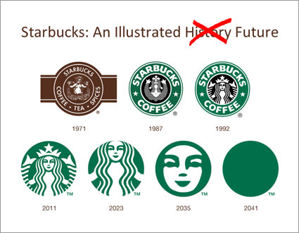
It’s early enough into the new year that you probably remember the horrific MS Paint meets clip art Gap logo redesign. After a slew of negative feedback on the new design, the company (wisely) decided that they’d fixed something that wasn’t broken and reverted to the old logo. After releasing a new, wordless logo Starbucks is facing a similar bit of online outrage, but don’t look for Starbucks to pull a Gap-like “just kidding!” and dump the new logo.
For starters, even though the name of the coffee shop behemoth has been dropped from the new logo, the siren and color are still recognizable as belonging to Starbucks. Gap’s now current, once former logo was already so simple that taking parts away just didn’t make sense. Even though McDonald’s doesn’t always use its name in logos, there’s no mistaking the golden arches for any other hamburger chain. Nike’s swoosh doesn’t require a name to be recognized, neither do Adidas’ 3 stripes.
Then, you have the fact that Starbucks isn’t just coffee, and if they want to emphasize that as part of their growth plans, it probably helps to not be tied to a logo that says coffee. While you might still buy workout clothing if Nike’s logo included the word “sneakers,” it’s not necessary and after a certain point would probably limit the brand. If Starbucks wants to emphasize their teas, or sandwiches or pastries, building a brand around a point that’s more about Starbucks and less about coffee, it’s not a bad move.
If anything, this is more reminiscent about Facebook’s various redesigns over the years. With each change, vocal users would demand the old, familiar design back (that includes us) and threaten a mass exodus if it didn’t happen. Inevitably, no one left in mass, and those that did were replaced with two or three new users. Somehow we’re thinking this is a change most Starbucks patrons will be able to swallow as well.

